The Brain Tumour Charity
Rebranding and renaming the UK's leading Brain Tumour charity.
HOW CAN WE EXPAND APPEAL AND AWARENESS THROUGH BRAND POSITIONING & MESSAGING?
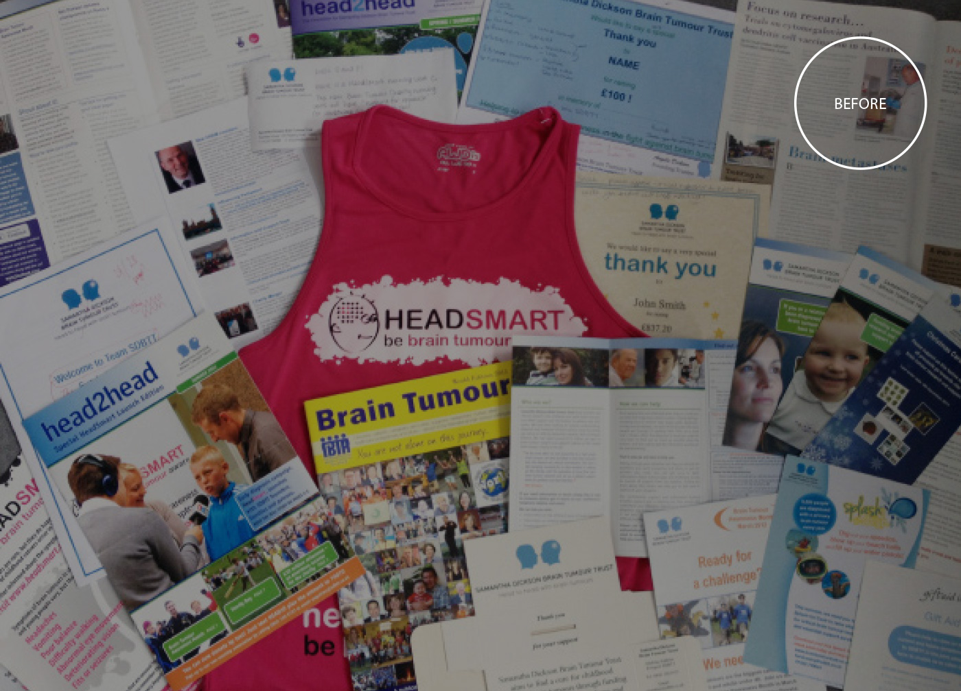
The leading Brain Tumour charity - The Samantha Dickson Brain Tumour Trust tasked us to help them increase their brand recognition and improve general awareness of brain tumours. The charity was started by Samantha Dicksons’ parents in 1996 after their daughter passed away from a brain tumour. They had grown the charity to turnover £2million a year after spotting a gap in Brain Tumour research. Their work was admirable and extremely successful, yet the charity was unheard of. It was time for a brand refresh in order to grow and push the boundaries of research.
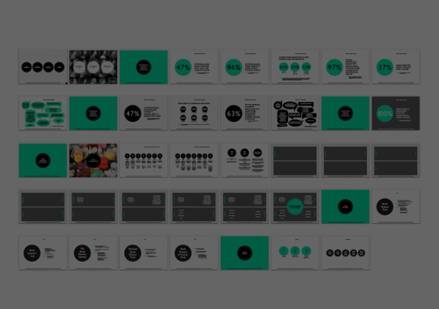
We started by realigning their vision and values, beginning with focus groups both internally and externally. The spectrum covered all audiences, from researchers, receptionists, health-carers, consultants, those diagnosed, their family members and people who had never come into contact with the charity itself or brain tumours. These results formed a set of valuable information reference points that we referred to whilst developing the brand.

Renaming the charity was a fundamental step in its success and getting it right was a mixture of creativity and sensibility. They were the largest dedicated brain tumour charity in the UK, but were unable to see this themselves. We simply reflected this in the new name, The Brain Tumour Charity. It echoed confidence and mirrored the straight forward, focussed approach of the charity’s actions whilst giving them the authority that they so rightly deserved.
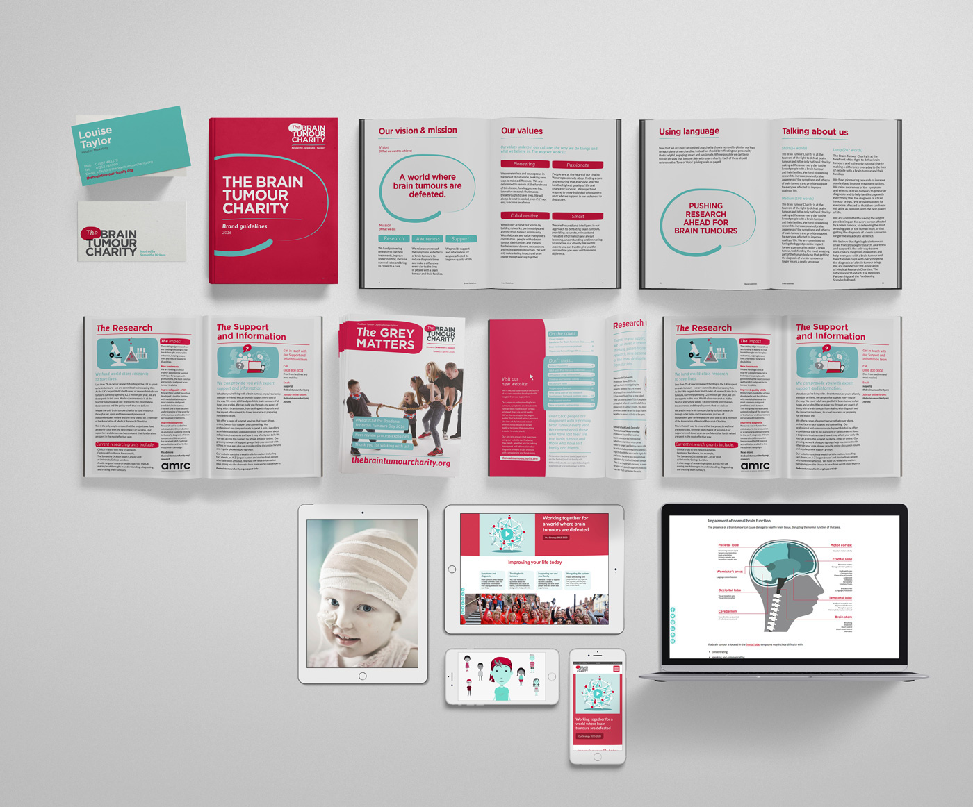
Following the brand design strategy, whereby we established the values that need to be reflected as well as the brand essence of ‘Passionately Focussed’, we developed a brand tool-kit. This gave the internal marketing and communications team the verbal and visual structure it had been lacking but also the flexibility to develop and build the brand. The guidelines we produced covered many eventualities and gave direction towards dealing with most situations geared to a variety of audiences.

DESIGN DETAILS
Alongside the verbal brand delivery was the identity, which covered a multitude of outputs and elements from the confident, bold and assertive logotype to image direction which informed but also gave a sense of hope. To illustrations that ranged from fun fundraising topics to more in-depth medical explanatory diagrams. The objective was to be an approachable brand that didn’t assume too much and put clear, digestible, straightforward and insightful information first.
The identity was taken across all outputs from print, through to digital across a number of channels. Since the re-brand the charity have secured new patrons such as Tom Daley, enabling a huge social media following. This has increased their turnover from £2million to almost £13million and grown from a team of 14 to 80+. The new brand has given them the status and recognition to establish corporate sponsorships that were impossible before.
