Fashercise
Branding, website and packaging for Fashercise.
MARRYING ECOMMERCE, EDITORIAL & FASHION
The very initial brief was to create a new identity for Fashercise. Before the visual side could be tackled the brand and it’s strategy needed addressing, the aim was to help deliver a seamless global mix of curated shopping and cutting edge editorial, seasoned with fun. Inspiration came from understanding the Fashercise Girl, the main starting point was helping to realign the brand both verbally and visually.
The challenge was marrying eCommerce & editorial together with fashion & fitness in a fluid way. As ever content was king, we wanted viewers to discover new products through editorial storytelling. Re-addressing the brand from all angles ensured that it reflected the astute, quirky and informative character through all outputs and got the mix of eCommerce and editorial well balanced.

ART DIRECTION
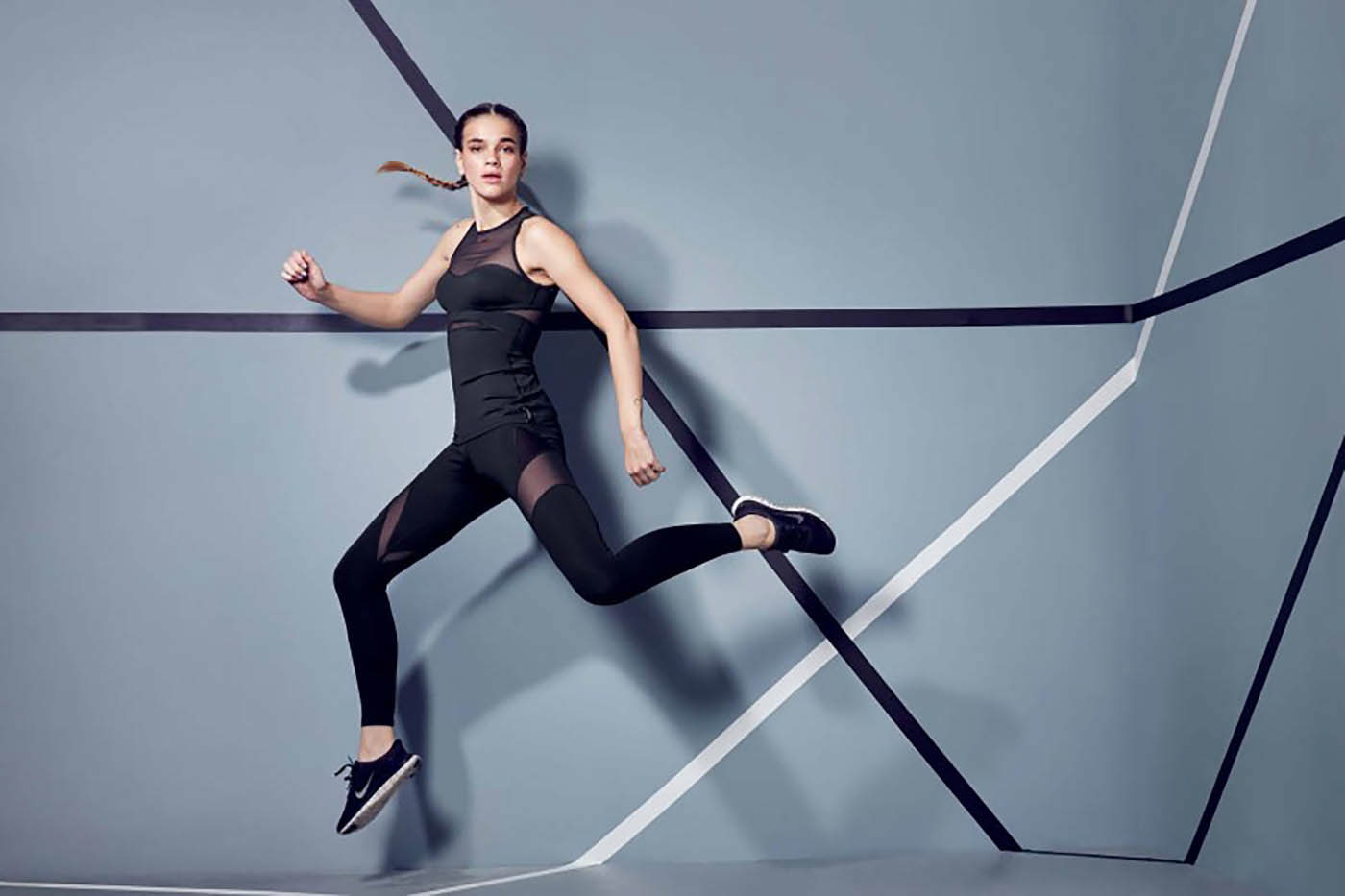
Part of the brand development consisted of art directing for both the look-books of the seasonal curated collections as well as product photography for the eCommerce site and Instagram channel. The outputs were bold and striking visuals that reflect the high-end sportswear pieces. The models all had an athletic physique yet were still relatable to the Fashercise target audience.
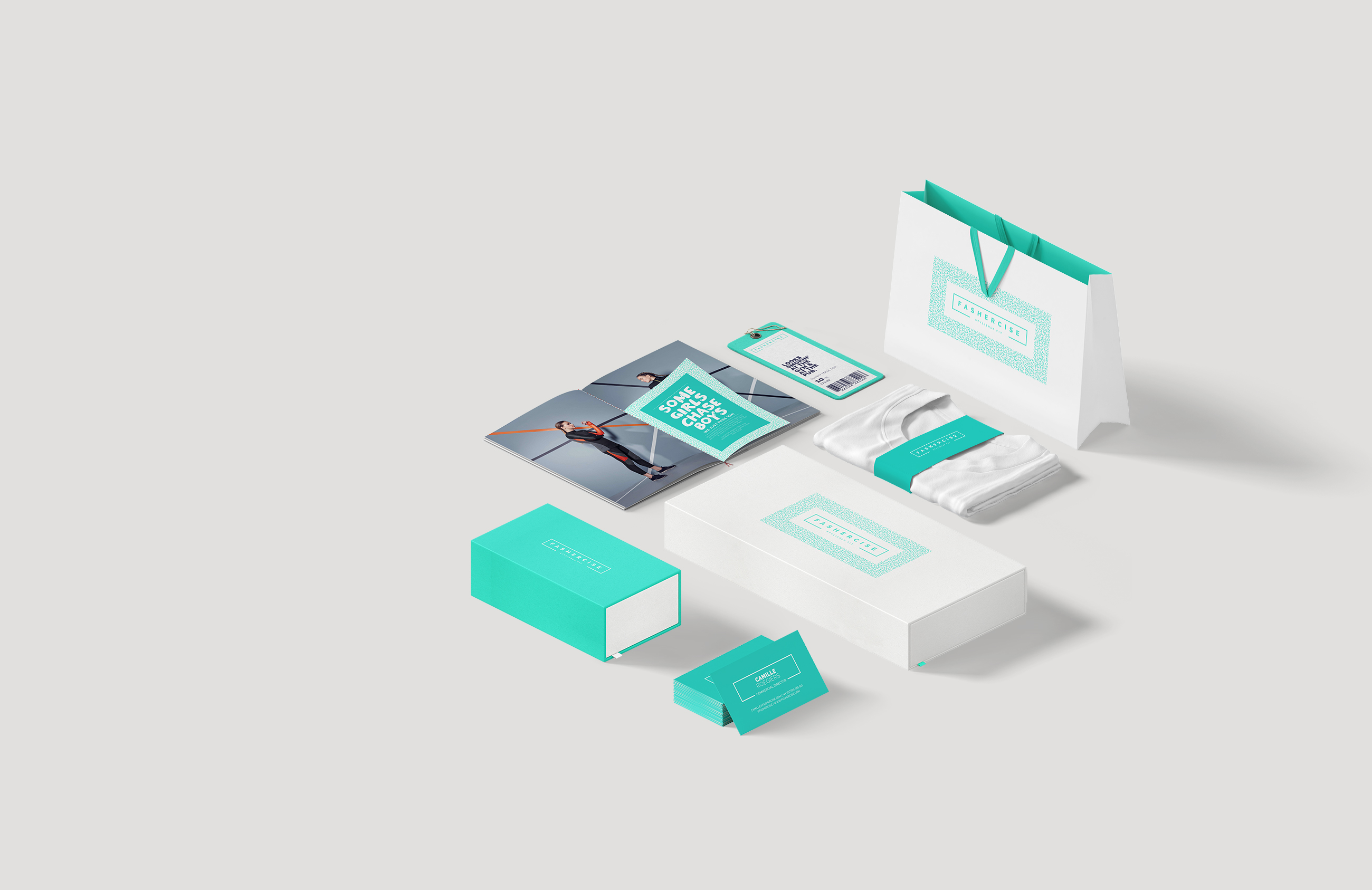
DESIGN DETAILS
Visual cues came from the products and patterns found on trainer soles and fabric prints, this enabled us to develop a set of unique Fashercise patterns which reflected the brands energetic behaviour. A secondary headline typeface was adopted to pack more punch and add pace to editorial pieces. Every brand touch-point was designed to ensure a cohesive and strong brand presence, vital for a new company, from the packaging and tote bags to the product labels and email newsletters.