DAD · Home Repairs App
A modern home repairs App & Branding.
HOW CAN WE USE TECHNOLOGY TO REVOLUTIONISE AN AGE OLD SECTOR YET REMAIN HUMAN?
An app that connects customers in need with experts in home repair, backed and funded by the CEO of HomeServe. The task was to differentiate an offering for what is such a traditional set of services, plumbing, gas and heating specialist. What exactly was it that makes this platform different, what do they stand for and why should users care?
The answer was in fact right in front of us - do exactly what everyone else isn’t. The wants and needs of each customer began to form the basis of our thinking. ‘Making life simple’ - this became the core of the brand, it became the point of difference and a constant reminder of why the business exists.
WHAT DO WE CALL IT?
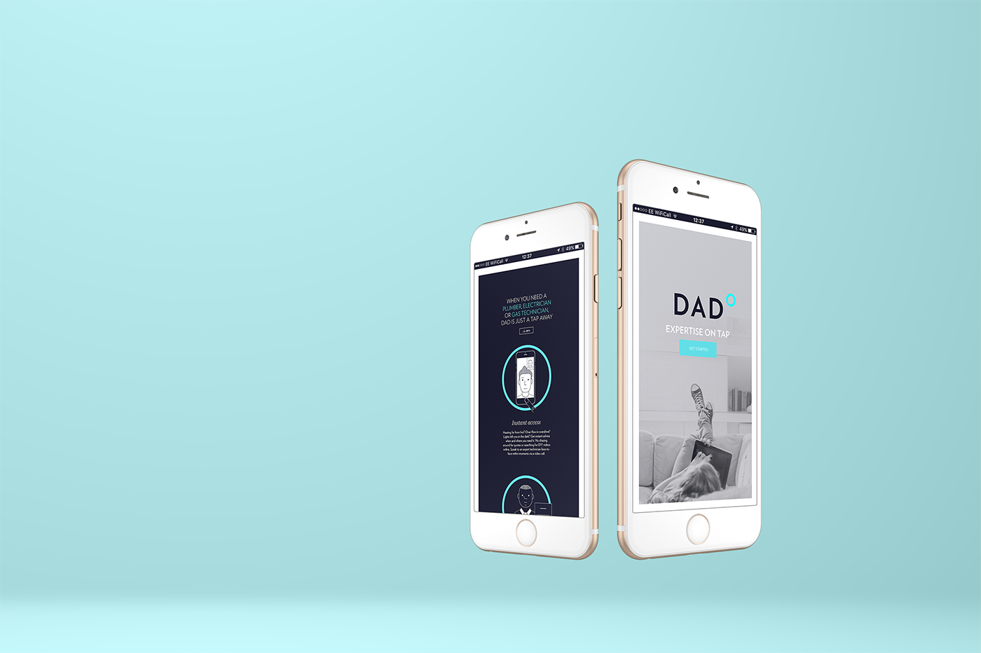
The first person you want to speak to in a moment of need. Someone you could rely on to solve a practical problem in your home. Someone who always keeps their eye out for you. On hand whenever you need them. Someone whom you trust implicitly... DAD. It’s nifty acronym is Done And Dusted.
WHAT DOES IT LOOK LIKE? WHAT'S THE MESSAGING?
With ‘Making Life Simple’ as our brand core we used this strategy to drive many decisions about the visual direction as well as the service, from bespoke illustrations to the choice of typefaces, we wanted to bring about a human aspect to what could have become considered a faceless service when digitised.
The simplicity carried through the identity from the wordmark and icon to the illustration style and the tone of voice. We’re people talking to people and that matters.
With a group of incredibly knowledgeable experts ready to start helping customers we developed the app interface to make the beta phase launch.
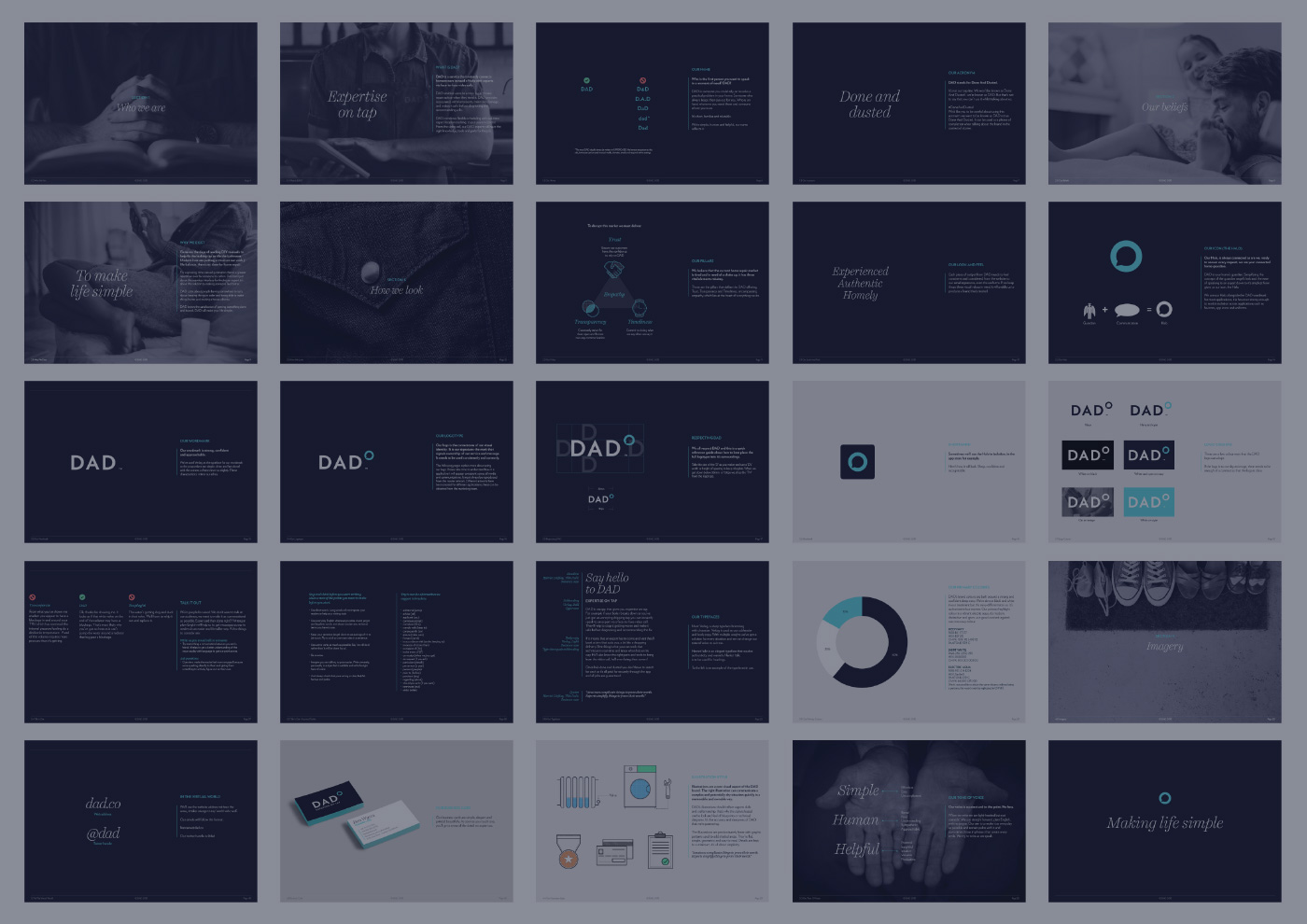
DESIGN DETAILS
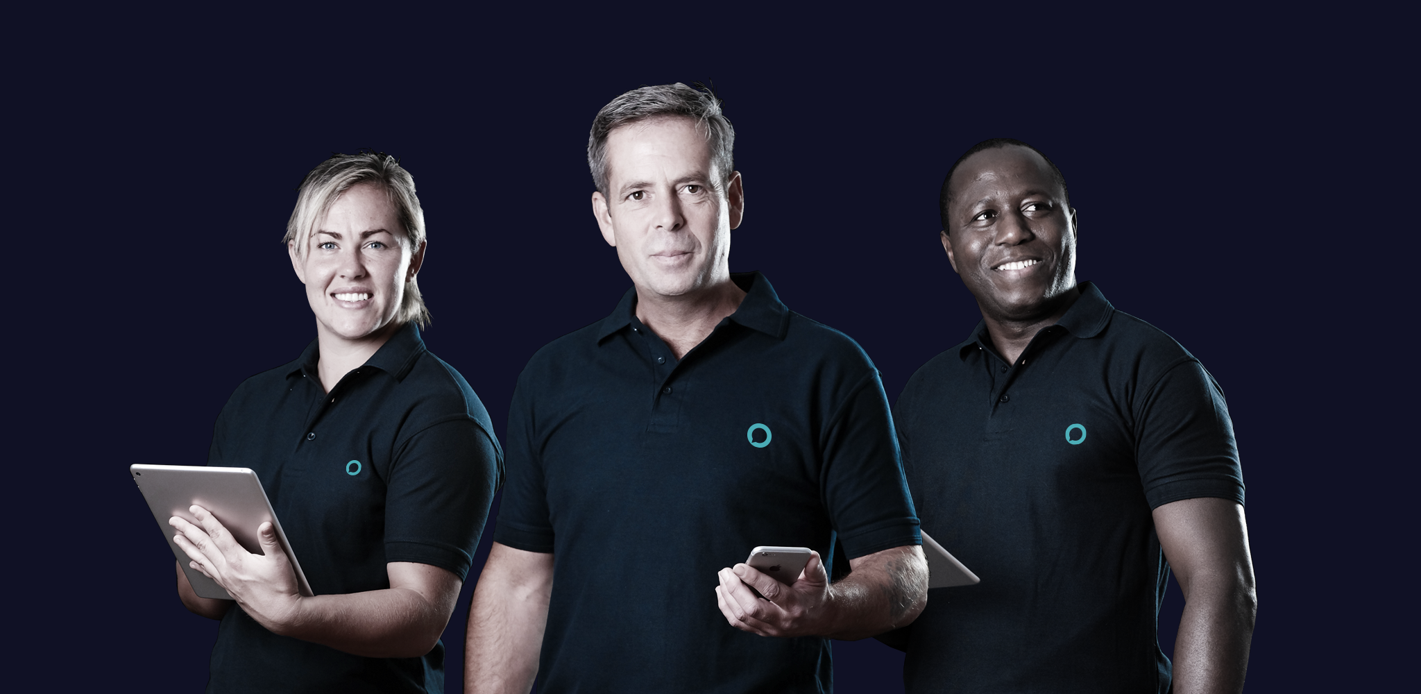
All aspects of the brand were developed, ensuring we’d not missed a single customer touch-point, from the logo to the technicians uniforms, even detailing the technician’s scent and their newly designed steel cap boots with brand colour laces.
The logo reflected the concept that DAD was your home guardian, with connotations of a halo and the conversational speech bubble. The logotype went through many iterations in order to achieve a considered, bold marque.
The initial technician profile shots were art directed to avoid the stereotypical ‘plumber with a wrench’ image. The lighting and angle allowed them to appear almost heroic but in a softer, friendly and approachable way.
Brand icons and illustrations were developed to reflect the simple and human brand character. All of the design emphasised the making like simple strapline. Strong geometry used throughout gave an engineered feel without being too technical so that we were inclusive.